Arcade Liar
Leeds has a vibrant city centre shopping area. Following similar experiences previously, I arrived off the train on a cold thursday afternoon to find a mass of activity.
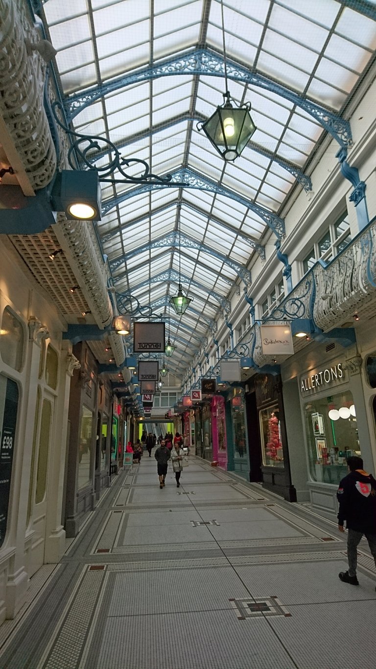
A striking feature of the centre are the number of arcades criss crossing between blocks. The grand entrances and ornate roofs of an opulence that is often synonymous with many industrial era structures.
What struck me about these spaces were the sense of occasion they bestow upon the user. There is something exciting and engaging about them. They feel like you are entering into some special world. Protected from the elements, people take their time passing through these arcades. Many stores had set up tables and chairs outside creating a continental piaza type ambience, with the gentle hum of conversations amplified by the closed off environment.
I counted at least a half dozen of these spaces within the city centre, protected from the elements, and feel sure that these must play a key role in the continued success of Leeds centre.
Fast forward to present day and one block down from the most southerly arcade, adjacent to the market, is the new victoria gate shopping centre and John Lewis.
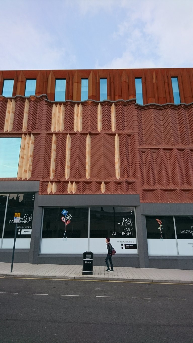
Externally the main Victoria gate building appears to be beautifully detailed*. The facade of brick is a complex amalgamation of turning red brick and chamfered stone, referencing the adjacent buildings and appearing of place both in scale and materiality. At the same time the building avoids being pastiche by introducing new contemporary compositions of the principle materials that contrast the carefully sculpted adornment of its predecessors.
Victoria Gate Elevation
Victoria Gate brick/stone detailing
Inside similarly the building has taken its lead from the other arcades. There is a sense of prestige bought by the unification of shop signs. The two layer frontages and shapely roof lend to an impression of craft and consideration, and the wide boulevard between the shops allows places to stop, creating a sense of place.
But despite these similarities, the experience of arrival to this new building is distinctly lacking, and despite its continuity, the new ’arcade’ feels disconnected from its neighbours.
The reason for this is in the buildings outlook. With no external windows or shop fronts, the building envelope forms a solid wall around the shopping area inside. Without any vistas to gaze in on, there is no browsing, and the surrounding streets are empty.
Traditional Entrance
Plan of victoria gate at top, traditional arcade bottom
Plan of victoria gate at top, traditional arcade bottom
Entry into the building is also much more difficult to get in, with only one main entrance at the top and two exit to the bottom, contrasted with the 6-8 ornate and highly visible entrances of the traditional arcades.
In this way Victoria Gate has taken leave of the traditional model and reverted to the modern ‘mall’ typology. These spaces intend to disorientate the user, making them lose track of time by cutting them off from the outside worlds. Reducing opportunities to wander in and out of the shopping area, both physically and mentally, the intention is for you to effectively become lost inside, ultimately encouraging you into more shops and spend more money.
The experience inside the centre feels like a vortex, sucking you in at the top, leading you downhill away from the original city, whirling you around, and spitting you out the rear near the car park at the lowest point. The new city centre mall, whilst offering out one hand toward the city in friendship, seeks to drag people away from it with the other, and in doing so it disconnects from the city. What will the long term impact be of this type of building?
Nationally and internationally the decline of the city centre has been well documented. In response to this Leeds appears to provide a number of positive lessons in the countenance of this trend. The building of the Victoria Gate demonstrates a local policy for centralised commercial development. However, whilst the architecture of Victoria Gate dazzles, have the town planners had the wool pulled over their eyes?
*I was later made aware that the brick tone on the external envelope are infact pre-made panels of brick and stone, detracting slightly from the sense of craft that went into the construction of the building, if not the overall appearance.


